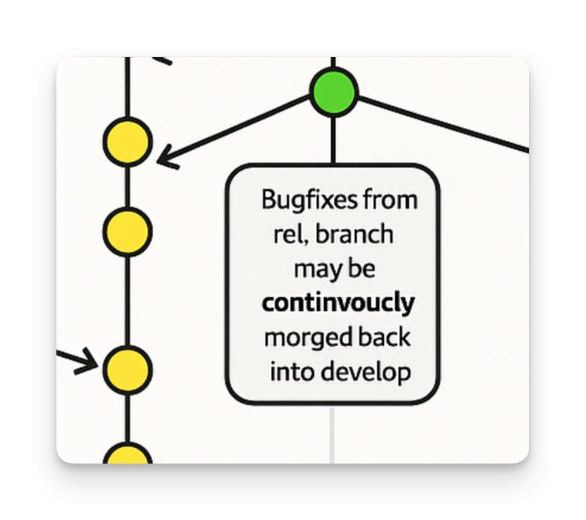
A few days ago, people started tagging me on Bluesky and Hacker News about a diagram on Microsoft's Learn portal. It looked... familiar.
In 2010, I wrote A successful Git branching model and created a diagram to go with it. I designed that diagram in Apple Keynote, at the time obsessing over the colors, the curves, and the layout until it clearly communicated how branches relate to each other over time. I also published the source file so others could build on it. That diagram has since spread everywhere: in books, talks, blog posts, team wikis, and YouTube videos. I never minded. That was the whole point: sharing knowledge and letting the internet take it by storm!
What I did not expect was for Microsoft, a trillion-dollar company, some 15+ years later, to apparently run it through an AI image generator and publish the result on their official Learn portal, without any credit or link back to the original.

The AI rip-off was not just ugly. It was careless, blatantly amateuristic, and lacking any ambition, to put it gently. Microsoft unworthy. The carefully crafted visual language and layout of the original, the branch colors, the lane design, the dot and bubble alignment that made the original so readable—all of it had been muddled into a laughable form. Proper AI slop.
Arrows missing and pointing in the wrong direction, and the obvious "continvoucly morged" text quickly gave it away as a cheap AI artifact.
It had the rough shape of my diagram though. Enough actually so that people recognized the original in it and started calling Microsoft out on it and reaching out to me. That so many people were upset about this was really nice, honestly. That, and "continvoucly morged" was a very fun meme—thank you, internet! 😄
Oh god yes, Microsoft continvoucly morged my diagram there for sure 😬
— Vincent Driessen (@nvie.com) 2026-02-16T20:55:54.762Z
Other than that, I find this whole thing mostly very saddening. Not because some company used my diagram. As I said, it's been everywhere for 15 years and I've always been fine with that. What's dispiriting is the (lack of) process and care: take someone's carefully crafted work, run it through a machine to wash off the fingerprints, and ship it as your own. This isn't a case of being inspired by something and building on it. It's the opposite of that. It's taking something that worked and making it worse. Is there even a goal here beyond "generating content"?
What's slightly worrying me is that this time around, the diagram was both well-known enough and obviously AI-slop-y enough that it was easy to spot as plagiarism. But we all know there will just be more and more content like this that isn't so well-known or soon will get mutated or disguised in more advanced ways that this plagiarism no longer will be recognizable as such.
I don't need much here. A simple link back and attribution to the original article would be a good start. I would also be interested in understanding how this Learn page at Microsoft came to be, what the goals were here, and what the process has been that led to the creation of this ugly asset, and how there seemingly has not been any form of proof-reading for a document used as a learning resource by many developers.
Till next 'tim'.